Responsive Design
Fields in one column
Starting with version 4.10, Orbeon Forms supports responsive design for forms you create with Form Builder. One significant implication is that when your forms are shown on a narrow screen, for instance on a mobile phone, most fields are reflowed to be on the same "column".
Example
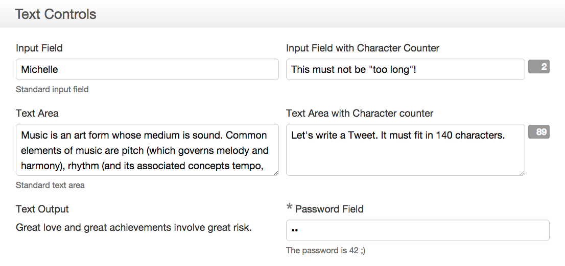
If you have a form with a section containing a grid with two columns, on a desktop or tablet your form might show as:

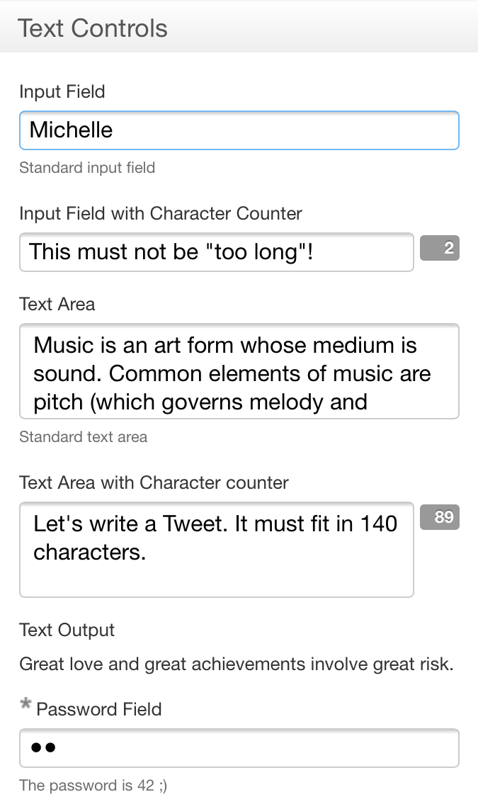
When the same form is loaded from a mobile phone, fields will automatically be shown in one column to better fit that screen:

Limitations
Version 4.10 introduces responsive design to the "detail page", i.e. the page used to fill out a form, as it is the page accessed by most end users, who are also more likely to be using a mobile device. In future versions, responsive design will be brought also to the summary page and home page.