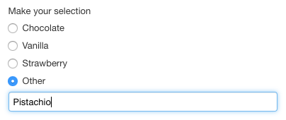
Open Selection Component
Availability
[SINCE Orbeon Forms 4.11]
What it does
The fr:open-select1 component presents:
- a list of radio buttons predefined by the form author
- and a custom choice ("Other") which the user has the option to specify instead

Usage
You use fr:open-select1 like a regular xf:select1 control:
<fr:open-select1 id="flavor" bind="flavor-bind">
    <xf:label>Make your selection</xf:label>
    <xf:item>
        <xf:label>Chocolate</xf:label>
        <xf:value>chocolate</xf:value>
    </xf:item>
    <xf:item>
        <xf:label>Vanilla</xf:label>
        <xf:value>vanilla</xf:value>
    </xf:item>
    <xf:item>
        <xf:label>Strawberry</xf:label>
        <xf:value>strawberry</xf:value>
    </xf:item>
</fr:open-select1>
Advanced usage
fr:open-select1 supports the following attributes:
appearancefull: shows radio buttons (the default)minimal: shows a dropdown menu
This is the control with the minimal appearance:

Data format
The predefined radio buttons have a label and a value, and, like all radio buttons, store their value into the data.
The text of the custom choice entered by the user is saved directly into the data.