XBL Components Metadata
- Rationale
- Namespace
- Group metadata for the toolbox
- Control metadata for the toolbox
- Control metadata for the markup to insert in the form
- Control metadata for the Control Settings dialog
Rationale
XBL components can be loaded by the Form Builder toolbox. In order for Form Builder to have information about those components, metadata can be added to each XBL binding.

Namespace
The Form Builder specific extensions are in an namespace::
- URI:
http://orbeon.org/oxf/xml/form-builder - Usual prefix:
fb - Example:
xmlns:fb="xmlns="http://orbeon.org/oxf/xml/form-builder"
Group metadata for the toolbox
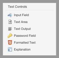
In XBL, each component is defined in an <xbl:binding> element and multiple <xbl:binding> can be grouped under an <xbl:xbl> element. The Form Builder toolbox shows components, grouped by "types of components", e.g. "Text Controls", as shown at the right of this text. To instruct Form Builder that multiple component should be grouped together in the toolbar, place then inside the same <xbl:xbl>. Then, as a child element of <xbl:xbl>, you provide the title for the group inside an <fb:metadata>, as in (see the full source):
<fb:metadata>
    <fb:display-name lang="en">Text Controls</fb:display-name>
    <fb:display-name lang="fr">Contrôles texte</fb:display-name>
</metadata>
Control metadata for the toolbox
To be used in Form Builder, your XBL component must have an additional <fb:metadata> section inside the <xbl:binding> of your component. That <fb:metadata> provides to Form Builder the localized display name for the component, an icon, and the markup to be inserted by Form Builder into the form when the component is used. For instance, the <metadata> section for the date picker component look like (see the full source):
<fb:metadata xmlns="http://orbeon.org/oxf/xml/form-builder">
    <fb:display-name lang="en">Date Picker</fb:display-name>
    <fb:display-name lang="fr">Sélecteur de date</fb:display-name>
    <fb:icon lang="en">
        <fb:small-icon>/apps/fr/style/images/silk/date.png</fb:small-icon>
        <fb:large-icon>/apps/fr/style/images/silk/date.png</fb:large-icon>
    </fb:icon>
    <!-- Other metadata information -->
</fb:metadata>
Control metadata for the markup to insert in the form
When form authors add an instance of your component from Form Builder, Form Builder needs to… well, add the component to the form. For this, inside the <fb:templates> for your component you declare:
- Inside
<fb:view>, the markup that goes in the view, e.g.<xf:input>for a plain XForms input. - Optionally, on
<fb:bind>, attributes you might want to add to the<xf:bind>Form Builder adds for your component. - Optionally, and this is rare, inside
<fb:resources>, additional resource elements the component might use, in addition to thelabel,help,hint, andalert. E.g. this is used in explanation.xbl.
<fb:templates>
    <fb:view>
        <my:component>
            <xf:label ref=""/>
            <xf:hint ref=""/>
            <xf:help ref=""/>
            <xf:alert ref=""/>
        </my:component>
    </fb:view>
    <fb:bind type="xf:decimal"/>
    <fb:resources>
        <text/>
    </fb:resources>
</fb:templates>
If your component only needs a template for the view, which is maybe the most frequent use case, instead of nesting an <fb:view> inside an <fb:templates>, you can just use an <fb:template> element, as in:
<fb:template>
    <my:component>
        <xf:label ref=""/>
        <xf:hint ref=""/>
        <xf:help ref=""/>
        <xf:alert ref=""/>
    </my:component>
</fb:template>
Control metadata for the Control Settings dialog
Introduction
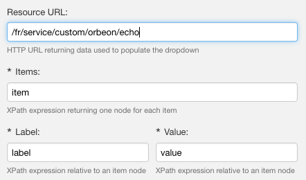
All the controls share certain properties, like the control name. However, some XBL components take additional properties, set at design time in Form Builder. For instance the Dynamic Data Dropdown takes:
- the HTTP URI of a service returning an XML document with the items shown in the drop-down,
- an XPath expression extracting the items from the XML document,
- and two XPath expressions returning the label and value for each item.

You can create a custom user interface within Form Builder for XBL component that require such additional properties by adding XForms controls under the the <fb:control-details> element, which you add under <fb:metadata>.
With Orbeon Forms 4.11 and newer
<fb:control-details> can contain any XForms control. In addition, you can place an <xf:model>, which can be used for:
- additional local instances
- validation
- event handlers
The content of <xf:model> is available to the control specified.
Example:
<fb:control-details>
    <xf:model>
        <xf:bind ref="@resource"/>
        <xf:bind ref="xf:itemset">
            <xf:bind
                ref="@ref | xf:label/@ref | xf:value/@ref"
                type="xxf:xpath2"
                required="true()"/>
        </xf:bind>
    </xf:model>
    <fr:grid>
        <xh:tr>
            <xh:td colspan="2">
                <xf:input ref="@resource">
                    <xf:label lang="en">Resource URL</xf:label>
                    <xf:label lang="fr">URL de la ressource</xf:label>
                    <xf:hint  lang="en">HTTP URL returning data used to populate the dropdown</xf:hint>
                    <xf:hint  lang="fr">URL HTTP auquel réside le service</xf:hint>
                </xf:input>
            </xh:td>
        </xh:tr>
        <xh:tr>
            <xh:td colspan="2">
                <xf:input ref="xf:itemset/@ref">
                    <xf:label ref="$resources/dialog-actions/items/label"/>
                    <xf:hint ref="$resources/dialog-actions/items/hint"/>
                </xf:input>
            </xh:td>
        </xh:tr>
        <xh:tr>
            <xh:td>
                <xf:input ref="xf:itemset/xf:label/@ref">
                    <xf:label ref="$resources/dialog-actions/item-label/label"/>
                    <xf:hint ref="$resources/dialog-actions/item-label/hint"/>
                </xf:input>
            </xh:td>
            <xh:td>
                <xf:input ref="xf:itemset/xf:value/@ref">
                    <xf:label ref="$resources/dialog-actions/item-value/label"/>
                    <xf:hint ref="$resources/dialog-actions/item-value/hint"/>
                </xf:input>
            </xh:td>
        </xh:tr>
    </fr:grid>
</fb:control-details>
Implicitly, there is always a default instance accessible with instance(), which contains the control being edited.
With Orbeon Forms 4.10 and earlier
The <fb:control-details> only supports <xf:input> controls. These are bound to attributes or elements inside the template you provided inside <fb:template>.
Example:
<fb:control-details>
    <xf:input ref="@resource">
        <xf:label lang="en">Resource URL</xf:label>
        <xf:label lang="fr">URL de la ressource</xf:label>
        <xf:hint  lang="en">HTTP URL returning data used to populate the dropdown</xf:hint>
        <xf:hint  lang="fr">URL HTTP auquel réside le service</xf:hint>
    </xf:input>
    <xf:input ref="xf:itemset/@ref">
        <xf:label ref="$resources/dialog-actions/items/label"/>
        <xf:hint ref="$resources/dialog-actions/items/hint"/>
    </xf:input>
    <xf:input ref="xf:itemset/xf:label/@ref">
        <xf:label ref="$resources/dialog-actions/item-label/label"/>
        <xf:hint ref="$resources/dialog-actions/item-label/hint"/>
    </xf:input>
    <xf:input ref="xf:itemset/xf:value/@ref">
        <xf:label ref="$resources/dialog-actions/item-value/label"/>
        <xf:hint ref="$resources/dialog-actions/item-value/hint"/>
    </xf:input>
</fb:control-details>
Internationalization of labels and other elements
The text for control <xf:label>, <xf:hint>, <xf:help>, and <xf:alert>, can either be:
- Inline, with a
langattribute indicating the language. This is what the author of the Dynamic Data Dropdown control did for the first<xf:input>above. - Taken from the Form Builder resource file, which is typically useful when your control uses resources that already exists elsewhere in Form Builder. In this case, you don't need to worry about what the current language is: Form Builder will automatically select the subset of the resource file that applies for the current language. This is what the author of the Dynamic Data Dropdown control did for the second
<xf:input>above.