Control Settings
Introduction
The Control Details dialog allows controlling all the aspects the a control besides its label and hint. The dialog has several tabs, detailed below.
Basic Settings
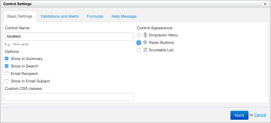
Basic options
The control name specifies a identifier for the control, unique in the entire form (except Section Templates). The identifier is used for the following:
- to refer to the control value from formulas
- to determine the name when the form data is represented as XML
If no control name is explicitly specified, Form Builder assigns a default name, such as control-42.
The following options are available:
- Show in Summary: when selected, the control value is visible as a summary page column
- Show in Search: when selected, the control value is searchable in the summary page
- Email Recipient: when selected, the control is used to determine an email recipient when the form data is sent by email
- Show in Email Subject: when selected, the control value is used as part of the subject of the email when the form data is sent by email
- Include as Email Attachment:
- SINCE Orbeon Forms 4.11
- this option only shows for file and image attachments
- when the property
oxf.fr.email.attach-filesis set toselected, only file and image attachments with this option checked are attached to the email
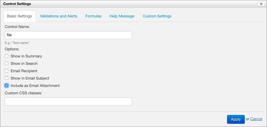
The "Custom CSS Classes" field allows adding CSS classes which will be placed on the control in the resulting HTML. This can be used for custom styling.
Control appearance
[SINCE Orbeon Forms 4.10]
Some controls support more than one appearance. For example, a single selection control can appear as a dropdown menu, or as radio buttons. When available, the "Control Appearance" selector allows selecting and changing the appearance of the control.
See also How the new Form Builder Appearance Selector Works.
Validations and alerts
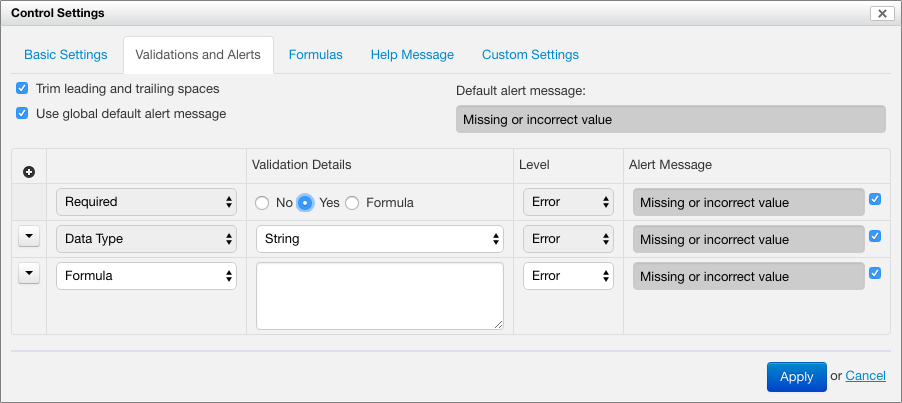
See Form Builder Validation for details.
Formulas
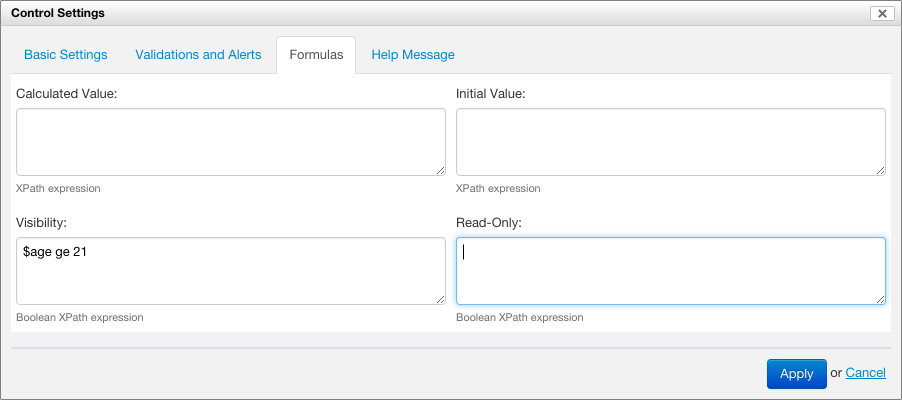
See Form Builder Formulas for details.
Help Message
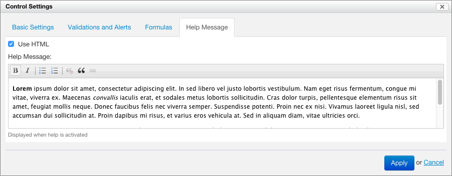
This allows specifying some help text, which can be plain text or rich text when the "Use HTML" checkbox is selected.
The help message is available at runtime through a help icon positioned next to the control. By default, the icon opens a pop-up containing the help text. In noscript mode, the icon links to a help section at the bottom of the form.
The help text is localizable.
See also Improving how we show help messages.